In Mike Mignola, the shadow does not describe where the light does not go: it occupies the page as an autonomous form, often larger than what it should cover. It is an inversion of the usual relationship between drawing and black: black is not what remains after the drawing, it is drawn first. This device makes his work recognizable as a plate, and it explains why his imitators almost all fail: they copy the aspect instead of copying the method.
It is one of the rare graphic styles of the medium which has produced an identifiable school, which deserves to be analyzed rather than noted.
This article describes the method, explains what it allows and what it prohibits, says why it is difficult to imitate, and specifies what it changes when reading.
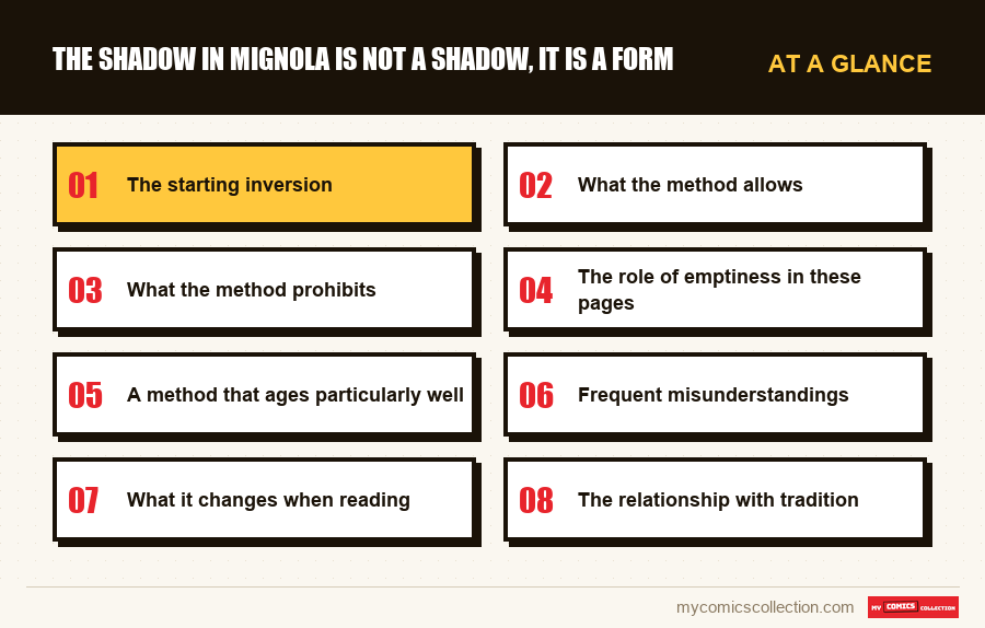
The starting inversion
To understand what is happening in these pages, we must first describe the ordinary practice from which they deviate.
In a classic drawing, you trace the shapes, then add the shadows. Black comes second, as a consequence: where light does not reach, we darken. The shadow is deduced from the geometry of the scene.
Here, the logic is reversed. The black masses are placed like compositional elements, with their own shape, their own balance, their own weight on the page. They do not arise from the scene: they structure it.
The most visible consequence is that these shadows are often fausses in the physical sense. They do not correspond to any coherent light source and cover surfaces that no real lighting would leave in the dark.
This freedom is not negligence: it is the device itself. A shadow subject to physics could not occupy the place we want to give it.
What the method allows
Une lecture instantanée
A page composed of large masses can be grasped at a glance. The gaze identifies the structure before reading the details, which considerably speeds up reading.
This is the opposite of a detailed drawing, which requires scanning.
A production economy
A solid black replaces hours of rendering. What passes for an aesthetic bias is also a sustainable working method over time.
An atmosphere without description
Worry arises from what we cannot see. A black mass suggests more than detailed decor would show, at no cost.
A framework for color
Large black areas isolate colored surfaces and prevent saturation. The color is contained there by the drawing itself.
What the method prohibits
Any strong constraint closes doors, and these are identifiable.
Open day scenes. A shade-based device works poorly in direct sunlight in an open space. These sequences exist and are visibly the least comfortable.
Nuanced expressions. A face largely plunged into darkness cannot carry subtle emotion. The emotional register is limited to what the silhouette and posture can say.
Informative decorations. When a scene requires understanding a precise topography (who is where, through which we pass) the black masses harm more than they help.
These three limits explain the choice of subjects. A work built on this device necessarily takes place at night, in ruins, with few characters: and this is not a thematic coincidence but a graphic consequence.
Style determines the stories here, not the other way around. This is a rare situation and is worth noting, because the opposite is generally assumed.
An author who wanted to recount investigations in broad daylight in offices would not have developed this method. This calls for abandoned places, nights, creatures, and the work was built around what she knew how to show.
Why is it so hard to imitate?
The style has produced many followers, very few of whom are convincing. The reason is instructive.
What we copy is the appearance. Large black areas, angular silhouettes, half-hidden faces. These elements are easy to reproduce and require no understanding.
What we don't copy is the composition. The real difficulty is to decide où put black so that the page stands upright: balance of masses, direction of gaze, breathing between full and empty areas.
A poorly composed imitated board produces an immediately recognizable result: it appears dirty rather than dark. The blacks accumulate without structure, and the reader no longer knows where to look.
This is the difference between a device and an effect. The first involves knowing why each decision is made; the second is satisfied with his appearance.
The role of emptiness in these pages
This style is described by its blacks. It should be described as much by what it leaves white, and this symmetry is poorly understood.
A large black mass only has an effect in contrast with a light area of comparable size. Without void, a solid color is no longer a shape: it is a background. The device is therefore based on a balance between two surfaces, one of which is empty.
This void is not an absence of work. Deciding not to put anything on a quarter page, on a medium where every inch costs, is a more difficult decision than filling it, and it's the one that imitators make the least often.
This is easily verified by comparing two boards: the one that works almost always has as much clear white as clear black, with few intermediate areas. The one that fails is saturated with gray and hatching.
This is also what explains the less fatigue when reading. A page that alternates between full and empty areas lets the eye rest between two points of attention, where a uniformly detailed drawing constantly solicits it.
A method that ages particularly well
An observation is evident when comparing boards from the same period, and it is due to structural reasons.
Rendering techniques date an image: a way of hatching, a type of frame, a texture effect belong to a moment and to tools. Thirty years later, they indicate their date before showing their subject.
A black solid color has no date. A solid shape is the most timeless thing a design can contain, because it bears no trace of how it was obtained.
This is why these pages do not seem to belong to the 1990s even though they date from them, when so many contemporary productions are immediately linked to them.
The same reasoning applies to digital reproduction. A solid color transmits perfectly at any resolution, where a fine frame deteriorates or becomes moire. This style was, without knowing it, perfectly adapted to supports that did not yet exist.
Collecting this series?
Track what you own, what you are missing and what your collection is worth. 7 day trial.
Start my trial →Frequent misunderstandings
Style taken for ease
Large flat areas seem like a shortcut. The difficulty is in their placement, not in their execution.
The dark confused with black
A board can be very black and very readable. Graphic obscurity does not imply confusion.
Emotion deemed absent
It comes through posture rather than the face, which makes it less immediate but no less present.
The impression held as neutral
A poor print results in solid areas becoming dull and causing them to lose their cut. The copy counts more than elsewhere.
What it changes when reading
Three concrete effects, perceptible from the first pages.
We read quickly. The pages are grabbed at once, which produces a rapid pace even on contemplative stories. An album can be played through in less time than one would expect from its apparent density.
We retain images. Compositions with large masses are imprinted in memory better than a detailed drawing, by the same logic that makes a logo memorable.
We reread differently. On the second reading, the eye goes to what he had neglected: the details housed in the light areas, often carrying narrative information.
This last effect is the most interesting. The method creates two unintentional reading levels: structure first, content second, and the order cannot be changed.
The relationship with tradition
A final element places this method in a history longer than that of the medium.
The use of large black masses organized in composition comes from engraving, where black is the raw material and all clarity must be wrested from the plate. It is a technical constraint that has become a language.
We also find it in posters from the beginning of the twentieth century, where readability from a distance required abandoning modeling in favor of clear-cut forms. These two traditions work on the same problem: making an image stand up with few resources.
Situating this style in this connection avoids a widespread misinterpretation, which consists of linking it exclusively to the horror story. There is nothing intrinsically worrying about the device: it is its use on these subjects that has made it so.
This is also what explains why it functions, for others, on entirely different registers.
What to record
On this designer, a field takes on an importance that it does not have elsewhere, and it relates to manufacturing.
The quality of the black printing, noted separately from the condition of the copy. A poorly printed solid color becomes caked and loses its shape: the shape ceases to be clear and the entire device collapses, even though the paper may otherwise be impeccable. On a drawing based on edge precision, this is the criterion that decides what you will see.
This is particularly true for old prints on absorbent paper, where the ink has diffused into the fibers.
The effective designer, the universe comprising numerous titles drawn by others: this is what makes it possible to constitute a homogeneous set of its own line rather than a thematic collection.
These two fields serve the same objective: to actually see what we are talking about, on a work where the material rendering is part of the device.
Questions fréquentes
No, and voluntarily. They do not correspond to any coherent light source and cover surfaces that no real lighting would leave in the dark. This is not an oversight: a shadow subject to physics could not occupy the place we want to give it in the composition.
Because they copy the appearance (large flat areas, angular silhouettes) without copying the composition, which is the real difficulty: deciding where to put the black so that the page stands up. A poorly composed copycat page looks dirty rather than dark, and the reader doesn't know where to look.
Clearly, and this is the most interesting point: the style here determines the stories rather than the other way around. The device works poorly in broad daylight, makes nuanced expressions difficult and blurs informative settings: hence nocturnal stories, in ruins, with few characters.
No way. It comes from engraving, where black is the raw material, and from posters from the beginning of the twentieth century, where legibility from a distance required clear-cut shapes. These two traditions work on the same problem, making an image hold together with few resources, and the device works elsewhere on other registers.
More than elsewhere. A poorly printed solid color becomes caked and loses its cut, which causes the entire device to collapse even though the paper may be impeccable. This is particularly true on old absorbent paper prints, where the ink has diffused into the fibers.
Are the blacks sharp, or dull?
A criterion independent of the condition of the paper, and decisive on a drawing based on the precision of the edges.