Jim Valentino has worked in the two production regimes that the medium knows, and his line does not behave in the same way. Its beginnings belong to the black and white of self-publishing, where the ink alone carries all the information; his series from the 1990s are in industrial color, where a layer applied by others covers his drawing. A thrifty trait depends much more on what comes after it than a busy trait: this explains why its pages sometimes appear heavier than they are.
This question seems technical. However, it determines which of its copies is worth buying at the same price.
This article compares what each regime does to its design, explains why certain pages deteriorate, and gives the criterion for choosing between two editions.
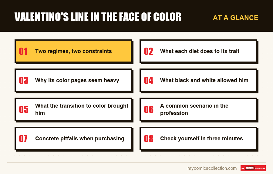
Two regimes, two constraints
We must first ask what each regime imposes, because the differences are deeper than a simple addition of color.
In black and white, the ink carries everything. Volume, material, distance, light, separation of planes: each information passes through the line, its density and its solid areas. Nothing will be corrected afterwards.
In industrial color, the ink carries the design and nothing else. Volume and light are entrusted to a colorist, the separation of the planes to a choice of shades. The designer delivers a structure and leaves a layer to others.
These are not two levels of finishing of the same practice: they are two different distributions of work. A design designed for one works poorly in the other, and this is a problem that many authors who have moved from one circuit to another have encountered.
What each diet does to its trait
In black and white: clarity pays
A sparing line, with clear flat areas and legible silhouettes, is exactly what this regime requires. His pages from this period work without reservation.
The short format and the comic register add tolerance: exaggeration replaces rendering.
In color: the line becomes fragile
A drawing with few lines provides large areas for color. Depending on what you put on it, the page breathes or becomes saturated.
The designer has no control over this choice or its rendering in print.
The paper of the period
The supports used in the early 1990s absorbed the ink and dulled the colors. Two copies of the same issue may differ significantly.
Later reissues
Reprinted on better supports, the same plates reveal a more airy drawing than we thought.
Why its color pages seem heavy
The observation is common among readers and the explanation is technical rather than artistic.
A drawing loaded with hatching absorbs color: the shades are deposited between the lines, the graphic frame remains dominant, and the result remains readable even if poorly printed.
On the contrary, a solid design offers large bare areas. Color becomes the main visible element, and its quality entirely determines the final impression. The thrifty line has no defense against poor colorization.
However, the coloring techniques of the early 1990s favored saturated shades, in a ray logic where the eye had to be attracted. Applied to large areas, they saturate the page.
However, the underlying design has not changed. This can be verified on the black and white plates published elsewhere, or on the better printed reissues, where the same composition appears significantly calmer.
The resulting purchase criterion is simple. On this designer, at a comparable price, systematically choose the best printed copy: the reissue rather than the original print, the clear paper rather than the tarnished paper.
On a busy designer, this advice would count for little: his line absorbs the faults. Here it really changes what you see.
What black and white allowed him
It's worth detailing what gets lost in the move to color, because it's not just about rendering.
Full control of the page. In self-published black and white, he decided everything: lines, values, contrasts, density. No visual decision escaped him.
The use of white as a material. A large area left empty is a strong graphic decision in black and white. In color, it becomes a surface to fill, and someone will fill it.
An assumed economy. Few lines is a quality recognized in black and white, where emptiness is part of the language. In color, this can appear as unfinished work.
This last perception is probably unfair, but it worked. The same line is read as refined in one regime and as summary in the other, without any line having moved.
What the transition to color brought him
It would be unfair to present this passage only as a loss, because it produced effects that black and white prohibited.
Superior action readability. In a scene where several costumed characters are fighting, color instantly separates them. In black and white, this separation requires considerable silhouette work that the monthly rhythm made difficult.
A lighter workload. Entrusting values and lighting to a colorist removes a real part of the rendering work, which makes a monthly sustainable for an author who otherwise assumed editorial responsibilities.
Access to an otherwise inaccessible audience. Independent black and white reached a few thousand readers; color in national distribution reached hundreds of thousands. It is a difference of nature, not of degree.
These three benefits are real and they explain a choice that was not just made. No author stays in black and white out of pure conviction when color opens up a hundred times wider audience.: and it would be naive to blame him for it.
What we can observe, however, is that his line has not been reworked accordingly. He remained that of a black and white artist, employed in a regime which demanded another.
A common scenario in the profession
His situation is not exceptional, and recognizing it helps to read other authors of the same generation.
The independent circuit of the 1980s trained many black and white designers, due to cost constraints. When some of them switched to color in the 1990s, everyone had to decide between two options.
Some charged their line to find a density that resists the colored layer, at the cost of increased production time. Others kept their economy of lines and accepted that color became the dominant element of their pages.
The two strategies are still seen today, and they produce opposite aging patterns. The loaded line resists bad impressions better; the economical trait gains more from good reissues.
Knowing which category a designer falls into therefore provides a directly applicable purchasing rule, well beyond this particular case.
Collecting this series?
Track what you own, what you are missing and what your collection is worth. 7 day trial.
Start my trial →Concrete pitfalls when purchasing
Tarnished paper
The supports from the early 1990s are yellowing, which greatly alters already saturated colors.
Advertisement photographs
A cover photographed under warm light does not provide information on the condition of the interior pages.
Uneven prints
Two copies of the same issue may differ significantly depending on their passage through the press.
Unreported reissues
A better printed reprint is indistinguishable from an original print on a cover photograph.
Check yourself in three minutes
All of the above is easily controlled, and it is better to see it than to take my word for it.
Take a plate from his period in color and a plate from his period in black and white, and compare not the rendering but the quantity of lines. You will notice that it is comparable: same density of lines, same solid areas, same economy.
What differs between the two prints is therefore not the work of the designer but what was placed on them. This is the most direct demonstration possible, and she only asks for two numbers for a few dollars.
The same exercise carried out on a designer from the same period gives the opposite result: the color almost disappears, absorbed by the graphic framework. The cross-comparison makes the phenomenon obvious.
What it suggests to read it
Three practical consequences, applicable immediately.
Start with black and white. His first series show his drawing in the regime for which he was trained, without intermediary or possible degradation.
Read the color carefully. If the pages seem busy, the question to ask yourself is whether it's the design or the layer applied to it, and the answer is most often the latter.
Look for a reissue when it exists. On series reproduced in volume, the difference in readability with the original print is considerable, for a price that is often comparable.
These three tips converge towards the same idea: on this author, the making of the object is part of the work that we judge, more clearly than with most of his contemporaries.
What to record
On this question, the sheet must record manufacturing information that nothing otherwise keeps.
The print quality and condition of the paper of each copy, noted separately from its general condition. A copy without creases or rubbing may have colors tarnished by a poor original print, which is not indicated by any condition scale. On a solid color designer, however, this is what determines what you will see when you open.
This note avoids repurchasing a better preserved but less well printed copy, an easy mistake since the two criteria are independent.
The mention reissue or original print, when you can establish it: on the repeated series, the difference in readability justifies knowing which one you own before looking for another.
These two fields relate to the printed object rather than the content, and this is precisely what is required for a drawing whose final rendering depends on steps that its author did not master.
Frequently asked questions
He is more faithful to his intention, which is not the same thing. In self-published black and white, he controlled lines, values and contrasts without any visual decision escaping him. In color, he delivers a structure and leaves a layer for others: two different divisions of labor.
Because a solid design offers large bare areas where color becomes the main visible element. The techniques of the early 1990s favored saturated hues to attract the eye on the shelf, which saturates a page with fewer lines. The underlying design has not changed.
Take the best printed-reissue rather than original print, clear paper rather than tarnished paper. On a busy designer this advice would count for little, his line absorbing the faults; here it actually changes what you see when opening the book.
No, and the two criteria are independent. A copy without creases or rubbing may have colors tarnished by a bad passage in the original press, which no condition scale indicates and which no cover photograph reveals.
By black and white, which shows his drawing in the regime for which he was trained, without intermediary or possible degradation. Then approach the color knowing that if the pages appear busy, the cause is most often the applied layer and not the drawing itself.
Well preserved, or well printed?
Two independent criteria that no state scale distinguishes.