Jim Valentino's design is the least spectacular of his generation of founders, and this is a choice rather than a limitation. Where his colleagues from 1992 relied on graphic demonstration (exaggerated analyses, exploded boxes, depth effects) he maintains a legible division, stable silhouettes and a narration which favors understanding. This bias explains both why his work made less of an impact at the time and why he ages better Today.
Few authors of this period allow themselves to be described by what they refused to do. Yet this is the fairest angle here.
This article describes its graphic method, what it refuses, how it evolves from one register to another, and what a reader should concretely expect from it.
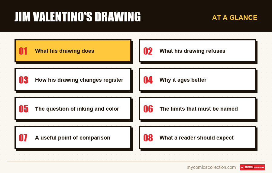
What his drawing does
Un découpage régulier
The boxes remain rectangular and aligned in the vast majority of pages. The grid varies little, which makes the reading journey immediate.
This went completely against the prevailing practices of his time.
Des silhouettes reconnaissables
Each character is distinguished by their build and posture rather than their accessories. They can be identified from afar, in small format.
Un trait économe
Few detailed lines, blacks used in flat areas rather than hatching. The drawing reads quickly and supports poor printing.
Des expressions marquées
The faces carry most of the emotion, with expressions pushed quite far: a direct legacy of his work of humor.
What his drawing refuses
The list is more revealing than the previous one, because each of these refusals was the norm around him.
La page-tableau. These full-page compositions where the image takes precedence over the story had become an obligatory passage. He rarely uses it, and never for free.
La case éclatée. The division into oblique overlapping fragments, supposed to reflect speed, complicates the reading process for a questionable impression gain. He largely abstains from it.
L'anatomie démonstrative. The impossible musculature and the postures that the human body does not allow are what have aged the worst from this period. His characters remain in plausible proportions.
These three refusals have one thing in common: they all prioritize readability over effect. A reader never stops at one of its pages and wonders what's going on there.
This bias had a real commercial cost. The market of his time rewarded precisely what it refused to do, and the best-selling series of those years were the most demonstrative.
It is therefore not a question of a designer incapable of the effects that he does not use, but of an author who maintained a choice against his immediate interest. This is useful information for reading its pages without condescension.
How his drawing changes register
He adapts his method to each project, and following these adaptations says a lot about his understanding of the profession.
In parody, the line pushes the caricature. The proportions are frankly distorted, the expressions reach excess, and the decor is reduced to what serves the gag.
In the space series, he disciplines himself. The rendering becomes more sober, the settings more detailed, and the caricature almost entirely disappears in favor of a clearer action.
In the vigilante cycle, he gets darker. The black areas gain ground, the frames tighten, and the space contracts to reflect the confinement of the character.
In the autobiography, he simplifies himself. The drawing is almost neutral, leaving the text and the situations to carry on alone: a classic solution of intimate storytelling, applied without mannerism.
Four treatments for just one hand. It is the mark of an author who thinks of drawing as a tool serving a purpose., a position less widespread than one imagines.
Why it ages better
The observation is verified by opening any comparison of pages from this period, and the explanation is structural.
A graphic effect is dated by nature: it belongs to a moment, to a fashion, to a tool. A page that relies entirely on effects therefore bears the date of its manufacture as a visible signature.
A page that relies on cutting and clarity carries nothing of the sort. Readability has no period style, or so little that it goes unnoticed thirty years later.
This is what produces the impression, when reading his series today, that they belong less clearly to their decade than those of his colleagues: even though they are exactly contemporary with it.
This is not artistic superiority, and it should not be overinterpreted. It is a property of the choices he has made, and it works in his favor over time.
Where does this discipline come from?
The sobriety of its division is not a temperament: it was learned, and we can say where.
A monthly series produced alone for several years imposes an absolute constraint: twenty-two pages must be delivered every month, without exception and without reinforcement. This obligation mechanically eliminates anything that costs time without serving the story.
A table page takes several days. An exploded division involves composing each fragment. Demonstrative anatomy requires posture research. None of these practices is compatible with monthly production alone, and this is probably where the choice was imposed before becoming a method.
His colleagues of the same generation worked differently, surrounded by inkers, colorists and sometimes set designers, which made the graphic demonstration sustainable.
The lesson goes beyond his case. Much of what we take to be a style is a production constraint assumed long enough to become a style, and knowing which one changes the way we look at the pages.
The question of inking and color
A rarely discussed aspect deserves to be asked, because it conditions the impression we keep from its pages.
A drawing that is economical with lines depends heavily on what comes after it. Thick inking weighs it down, garish color saturates it, mediocre printing confuses it, and the designer masters none of these three stages when they are entrusted to others.
Its pages from the 1990s visibly suffer from this in places. The colors of this period, produced with the techniques and papers of the moment, often crush flat areas which would have worked better with less material.
This is noticeable when comparing the same plate according to the reissues: the subsequent editions, better printed, allow a design that was thought to be heavier than it was to breathe.
This observation has a practical consequence for a buyer. On this specific designer, the quality of the copy's production counts more than on a busy designer, whose line absorbs printing defects. At a comparable price, choose the best printed copy.
Collecting this series?
Track what you own, what you are missing and what your collection is worth. 7 day trial.
Start my trial →The limits that must be named
Few memorable moments
A drawing that refuses demonstration rarely produces the image that we retain ten years later. This is the direct flip side of bias.
Uneven decorations
The constraint of calendar is seen in the backgrounds, sometimes reduced to flat areas or summary vanishing lines.
Action without flight
The fight scenes are clear but unspectacular, which is a disservice to a genre that relies heavily on them.
Close faces
The distinction between the characters comes through the silhouette; in close-up, some look more similar.
A useful point of comparison
A simple way to verify all of the above is to place two plates from the same year side by side, one by him and the other by a demonstrative designer of the same generation.
The contrast does not relate to the quality of the line, often to the advantage of the second, but to what each page asks of the reader. One can be read in order without hesitation; the other requires reconstructing the reading meaning before understanding the scene.
This experiment is more convincing than any argument, and it costs nothing to conduct since both are within a few dollars. She also explains why her series are easier to reread.: what never required effort requires no more effort thirty years later.
What a reader should expect
It is better to set your expectations before opening, which avoids the most common misunderstanding.
Don't expect a graphic slap. Nothing in these pages seeks to impress, and a reader who comes for that will be disappointed from the first page.
Expect a story that flows effortlessly. This is the constant quality of his work: we never reread a page to understand the sequence, which is not so common in his contemporary productions.
Wait for real evolution between registers. Reading his four sets in succession shows an author who adjusts his means rather than a designer who applies the same recipe.
This last wait is the most profitable. Taken in isolation, his series appear modest; read together, they outline a method, and this is where the interest in following it lies.
What to record
In this area, the relevant field is descriptive rather than factual, and it is only useful if we follow several registers.
The graphic register of each set, noted in one word: caricature, sober, dark, neutral. On an author whose main interest is the adjustment of the drawing to the subject, this is what makes it possible to find the series to compare rather than going through the entire bibliography.
This seems superfluous as long as you have three series. This becomes useful when you have fifteen of them, spread over three decades and four registers.
The numbers where the drawing falls, when you spot them: The sloppy sets and production shortcuts aren't distributed randomly, they're concentrated in periods of tight schedule, and noting it documents a production history that nothing else maintains.
These two fields are a matter of personal appreciation and not objective data. This is precisely what makes them irreplaceable: no one else will hold them for you.
Frequently asked questions
He's sober, which isn't the same thing. Regular cutting, stable silhouettes, economical lines: so many choices which favor readability over effect, completely going against the dominant practices of his time. This bias also had a real commercial cost, the market rewarding exactly what it refused to do.
Because a graphic effect belongs to a moment and a fashion, while readability has no period style. A page built on cutting and clarity does not bear the date of its manufacture, unlike a page built on effects: hence the impression that they belong less clearly to their decade.
No, and that's the most interesting thing: caricatured in the parody, sober in the space series, darker and tighter in the vigilante cycle, almost neutral in the autobiography. Four treatments for a single hand: the mark of an author who thinks of drawing as a tool serving a purpose.
Few memorable images: the direct reverse of the refusal of demonstration -, uneven settings where the calendar is tense, clear but unspectacular action scenes in a genre that relies on it, and faces sometimes close in close-up since the distinction comes through the silhouette.
Overall, without hesitation. Taken in isolation, his series appear modest; read consecutively, they outline a method of adjusting the means to the purpose. This is where the point of following him lies, and this is what a one-off reading cannot reveal.
Caricatural, sober, dark or neutral?
On an author who adjusts his means to each project, this is the field that allows comparison.