Signing a cover is a separate profession from drawing a comic, and Jim Valentino has signed some for issues he neither wrote nor drew. The ads show it: several explicitly credit “cover” alongside another name for the interior. This practice creates lasting confusion in a bibliography:the name on the front says nothing about what is found inside: and it explains some of the false attributions that we encounter about this author.
This is the last thread to unravel in this bibliography, and the most discreet.
This article explains what a cover requires to be different, why publishers use external signatures, what confusion this causes, and how to navigate it.
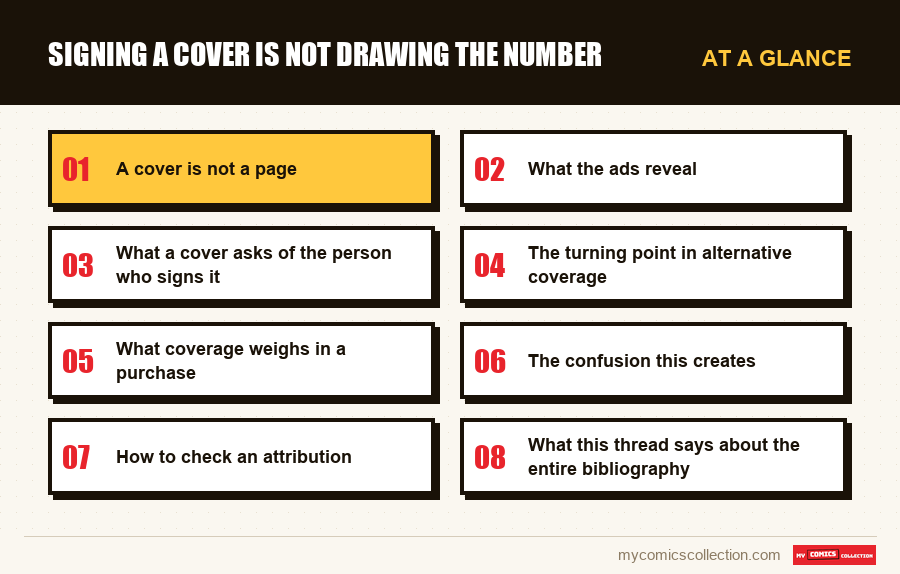
A cover is not a page
The two exercises are so similar that an excellent page designer can be a mediocre cover designer, and vice versa.
A page tells, a cover stops. The first must follow on from what precedes and what follows; the second must function isolated, seen from afar, in the middle of fifty others.
A page can be read, a cover can be seen. The attention span given to coverage on the shelf is measured in fractions of a second. Anything that requires examination is lost.
A page belongs to a sequence, a cover to a commercial operation. It must indicate the genre, promise content, and distinguish itself from its neighbors-constraints that have nothing to do with narration.
These differences explain why the position is often entrusted to someone other than the interior designer. This is not a mark of distrust towards him: it is the recognition that it is another job.
What the ads reveal
The observations below come from ad titles noted on August 29, 2026. They relate to how sellers describe credits, not prices.
Dissociated credit
Announcements explicitly mention a role of “writer and cover”, which by construction signals that the interior design belongs to someone else.
This is the most precise indication that a title can provide, and it is rare.
The name alone
The majority of ads simply cite the name, without function. A buyer cannot then conclude anything from what he buys.
Alternative covers
Recent publications noted include up to eight versions, some of which are signed by guest artists. The name given to one version does not apply to the others.
No effect on prices
Nothing in the statements distinguishes one version of coverage from another in the median requested. The signature does not produce an observable premium.
Why does a publisher use an external signature?
Three reasons meet, and they do not have the same status.
Notoriety. A well-known name on the cover increases store orders, regardless of content. This is a purely commercial use, perfectly accepted in the profession.
Specialization. Some designers excel at isolated images and get bored with narration. Entrusting them with the covers is a rational allocation.
The calendar. A designer who is late on his pages cannot also produce a cover. Delegating it saves the publication date.
These three patterns produce the same result for a collector: a name on the front which guarantees nothing on the pages. Distinguishing which of the three reasons applies is generally impossible from the outside.
The most common consequence is false attribution. A reader buys an issue for a name seen on the cover, opens it, and forms a judgment on a designer who has not drawn anything of what he is looking at.
This is how reputations are built crookedly, in both directions. An author may be credited for work that is not his or hers, or blamed for work that he or she did not do.
What a cover asks of the person who signs it
It is worth detailing the work itself, which is rarely described.
Remote readability. A cover must work in thumbnail, today more than ever since most buyers see it first on a screen of a few centimeters.
A centered composition. The logo occupies the top, the price a corner, a banner sometimes the bottom. The space actually available is more limited than it seems.
An honest promise. A cover that announces missing content produces a disappointment that backfires on the entire series. It is an ethical as well as a commercial constraint, often neglected at the time in question.
On this last point, the covers of the 1990s sinned greatly. The gap between the announced show and the content delivered is a feature of the period, and it contributed to the disenchantment that followed.
The turning point in alternative coverage
A major development separates the coverage of his early period from that of today, and it changes the nature of the problem.
Until the 1990s, an issue had a cover. It identified the object as surely as its number, and two visually identical specimens were the same specimen.
The multiplication of versions has broken this link. An issue can now exist under eight covers, some of which are signed by artists who have no connection with the series. Visual identification, which was the collector's most natural reflex, becomes misleading.
The list of its recent publications shows this directly: the advertisements distinguish the versions by a letter attached to the number, a system that nothing explains to the buyer and which did not exist thirty years earlier.
This development has a consequence that few measure. A collection formed before this practice is documented by the number; a collection formed afterwards can no longer do so, and the two halves of the same shelf therefore obey different rules.
What coverage weighs in a purchase
A final remark on the real role of coverage in an online purchasing decision, which is not what you think.
In a boutique market, the cover was the main argument: it was the only thing visible before opening. The commercial system of the medium was built on this evidence.
Online, the cover remains the only image of the ad but it has lost its function. The buyer already knows what he is looking for: it arrived by a search, not by a ray, and the image is only used to verify that it is the right object.
But it verifies poorly: it says nothing about the internal state, nothing about credits, nothing about completeness. This is a very visible and very uninformative image.
The practical consequence is not to decide on it. What matters is the text of the ad and, failing that, the questions we ask the seller.
Collecting this series?
Track what you own, what you are missing and what your collection is worth. 7 day trial.
Start my trial →The confusion this creates
The name taken for the author
A signature on the cover is read as an attribution of the entire issue, which it is not.
Multiple versions
The same issue exists under several covers signed differently. The file cannot be satisfied with the number.
The cover photography
It is the only visible element of an ad and the least representative of what we are buying.
Credits missing from the object
Some covers are not credited anywhere, neither on the front nor in the masthead.
Note also that the problem worsens over time rather than resolving. Each resale copies the title of the previous seller, including its approximations, so that a false attribution made once then circulates indefinitely without anyone verifying it. It is a slow mechanism and perfectly observable on old advertisements relisted for sale.
How to check an attribution
Two checks, in this order, which resolve almost all cases.
The bear, for the interior. It lists the designer of the pages. If the name differs from that associated with the cover, the question is resolved.
The cover notice, when it exists. Publications from certain periods explicitly credit the front illustration, often in small print on the back or in the masthead.
When neither of them provides information: a common case in old publications:visual comparison with the interior pages remains the last resort. A processing gap between cover and interior is usually visible, even to the untrained eye.
This method has its limits and it must be recognized: it fails when two designers have a similar style, which often happened in the studios of the time.
What this thread says about the entire bibliography
By closing this file, an observation emerges about this author as a whole.
Four distinct roles (designer, screenwriter, editorial director, cover illustrator) bear the same name on hundreds of publications, with no systematic indication to separate them.
No public tool solves this problem: neither announcements, which simplify, nor keyword searches, which do not filter functions, nor current catalogs, which index titles rather than roles.
This is the textbook case of the multiple-role author, and it's more common than you might think: every author-turned-publisher ends up in this situation.
The only practicable response is to keep the distinction yourself, copy by copy. It's tedious and it's irreplaceable.
What to record
On this question, the field to be kept concerns an object that the form usually treats as a simple visual.
The signatory of the cover, noted separately from the designer of the pages. These are two separate pieces of information that nothing connects, and confusing them is the most common source of misattribution. In a bibliography where four roles have the same name, this is the last missing distinction.
This is also what allows us to find a precise image: we remember a cover much more often than an interior page.
The Possessed Cover Version, on publications which include several: up to eight in the cases noted. Without it, the card describes a number without describing the object.
These two fields complete the usability of a bibliography that its author has made confusing by exercising too many professions. This is not a criticism: it is simply the price of a complete career.
Frequently asked questions
Absolutely not, and it is the most common source of misattribution. Signing a cover is a distinct profession, often entrusted to someone other than the designer of the pages: for notoriety, by specialization, or to save a publication date. Only the bear decides.
A page tells and follows; a blanket stops and operates isolated, seen from afar, in the middle of fifty others. Attention span is measured in fractions of a second, available space is constrained by the logo and price, and the function is commercial rather than narrative.
Nothing in the statements shows this: no cover version differs from another in terms of median demand, including on publications which have up to eight versions. The signature does not produce an observable premium on this bibliography.
By visual comparison between the cover and the interior pages: a processing gap is generally perceptible even to an untrained eye. The method has its limits and fails when two designers have a similar style, which often happened in the studios of the time.
Because four distinct roles (designer, screenwriter, editorial director, cover illustrator) have the same name on hundreds of publications without systematic indication. No public tool solves this problem, and this is the textbook case of the author turned publisher.
Who signed the cover, who designed the pages?
Two distinct pieces of information that nothing connects, and confusing them distorts an entire bibliography.