This drawing does not come from the comic strip but from the cartoon, and this can be seen in each panel. Shapes built on circles, contours of constant thickness, expressions pushed to the point of distortion, poses readable in silhouette: these are the rules of a profession where the image must function in a twenty-fourth of a second. Applied to a printed page, they produce a immediate readability that the graphic traditions of the medium do not achieve in the same way.
Identifying this connection changes the way we read these plates and explains several of their particularities.
This article sets out the rules borrowed, what they bring to the printed page, what they prohibit, and how they coexist with a second graphic register.
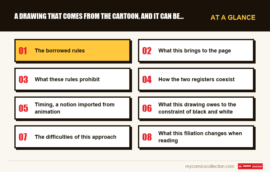
The borrowed rules
Four principles of classic animation are found as they are in these pages, and they are not those of comics.
Construction by simple volumes. The characters are built on spheres and cylinders, which allows them to be drawn from any angle without losing their resemblance. This is an animation requirement, a figure must remain itself while rotating, that a comic book artist can do without.
The line of constant thickness. Little modulation, few feather effects. This comes from the need to reproduce an identical contour thousands of times.
The pose readable in silhouette. Every attitude must be comprehensible reduced to a black form. This is a test rule used in animation and can be directly observed here.
L'expression poussée au maximum. The faces achieve deformations that a realistic drawing would not allow, because the emotion must be read instantly.
These four rules have a common goal: be understood before being looked at. This is the founding constraint of animation, and it produces effects on paper that few comic book artists seek.
What this brings to the page
Effortless reading
The reader grasps each box immediately, without having to decode who is where or what is happening. On a work of several thousand pages, this comfort counts.
This is the main contribution, and it explains the accessibility of the whole.
Un comique de mouvement
The gags rely on poses and sequences rather than dialogue, which makes them effective regardless of language.
Consistency over time
Geometrically constructed characters remain identical from one volume to another over thirteen years, without any deviation in style.
Lossless reproduction
Clean, minimally modulated outlines support all scales and print qualities, making reissues easier.
What these rules prohibit
Any method closes doors, and these are identifiable by reading.
La nuance d'expression. A face constructed for immediate emotion poorly conveys intermediate states: ambivalence, doubt, temporary embarrassment. These registers pass here through posture and silence rather than through the face.
Le détail signifiant. A drawing that favors general readability cannot accommodate information in a tiny detail, a common procedure among other authors.
La texture. The materials (fabric, stone, skin) are not rendered on the characters, which remain smooth surfaces.
These three limits explain why the main characters cannot carry the serious moments of the story. The drawing that constitutes them does not know how to do this, and this is one of the reasons why the work uses a second graphic register.
The second register is the solution to this limit. Settings and human characters are treated with a detail, texture and nuance of expression that the main figures do not have.
It is therefore not a simple aesthetic contrast: it is a distribution of tasks. What the animated register cannot express, the other register takes care of, and the two coexist in the same box without disturbing each other.
How the two registers coexist
Cohabitation requires technical precautions that are worth describing, because it easily fails.
The line thickness makes the connection. The two registers use a comparable outline, which places them on the same page despite their difference in treatment. Fine-art decor would have thrown the characters out of the picture.
The characters are never blended into the background. They maintain a clear outline that detaches them, which assumes the difference instead of masking it.
The values remain separate. The main figures are mostly clear, the decorations more elaborate in black and in raster, which maintains readability even in a busy panel.
The result is that we always perceive two types of image without ever having the impression of a collage. This is the least visible skill of the work and probably the most difficult.
Timing, a notion imported from animation
A concept specific to this profession is found here and it has no direct equivalent in the vocabulary of comics.
In animation, timing refers to the number of images devoted to an action: lengthening an anticipation, shortening an impact, letting a pose settle. This is what distinguishes a funny movement from a flat movement, with an identical design.
Transposed onto a page, the timing becomes the number of boxes devoted to a gesture. A fall that takes four squares is not the same as a fall in one square, even though the information is identical.
This is where the original formation is seen most clearly. The comedic sequences have panels that add nothing to the action-a held pose, a look at the reader, a pause-and these panels are precisely what makes the gag work.
A designer trained in comics would tend to delete them to save space. Keeping them is a costly choice in terms of pages, and this explains part of the length of the work.
What this drawing owes to the constraint of black and white
A second factor is added to the animated filiation and reinforces it, which explains the coherence of the result.
Self-publishing in this period printed in black and white for cost reasons. A designer deprived of color must obtain through the line everything that color would have carried: separation of planes, identification of characters, hierarchy of attention.
Or les règles d'animation répondent exactement à ce problème. Sharp edges, distinct silhouettes, separate values : these are the same solutions, developed for another reason.
The meeting between training as an animator and a constraint of black and white is therefore particularly fortunate: both push in the same direction, where other associations conflict.
This is also what explains why the subsequent transition to color changed the balance. Color assumes functions that the line already fulfilled, and this duplication attenuates the device instead of reinforcing it.
Collecting this series?
Track what you own, what you are missing and what your collection is worth. 7 day trial.
Start my trial →The difficulties of this approach
Binary emotions
The faces strongly express but poorly convey the intermediate states, which involve posture.
A load imbalance
The sets require a time of work out of all proportion to the characters, which weighs on the pace of production.
A register associated with childhood
The animated style classifies the work as youth before reading, which excludes part of its natural audience.
Few striking isolated images
A drawing designed for sequence rarely produces the board that we remember out of context.
Why do so few designers come from there?
The question deserves to be asked, because this filiation is rare even though its advantages are considerable.
The two professions do not recruit in the same way. Animation is an industry that trains teams to common rules; on the contrary, comics value the singularity of a hand, and a designer is judged on what sets him apart.
Animator training therefore pushes towards the opposite of what the medium rewards: shareable clarity rather than personal brand, consistency rather than evolution, efficiency rather than virtuosity.
This is probably why these passages are infrequent, and why those who do them produce works that are instantly recognizable: not through eccentricity but through a rigor that the industry does not expect.
This also explains the difficult initial reception of this type of work. A very readable drawing appears simple in the eyes of a readership accustomed to associating mastery with apparent complexity.
What this filiation changes when reading
Three observations directly applicable in front of a board.
Look at the poses before the faces. This is where the information comes through: a silhouette says what the character feels before their expression confirms it.
Follow the sequences of boxes. The gag sequences function like successive shots, with anticipation and reaction times borrowed from animation.
Note the blank boxes. They are numerous and often carry the essentials: a direct consequence of a training where the image must be sufficient.
This last habit really changes the experience. A reader who reads the bubbles and skims the images misses a large part of this story, because an unusual proportion of the information is not written.
Ce qu'il faut enregistrer
On a work whose graphic interest lies in the sequence, the file must retain what a rereading alone cannot find.
The silent sequences that left an impression on you, with their volume and approximate position. They are numerous, they often carry the decisive moments, and they are impossible to find by search since they contain no text. No index, no summary, no citation allows us to return to it.
This is the only way to reconstruct what you liked when you want to show it to someone.
The dominant register of each volume: comic, mixed, or predominantly serious: because it evolves over the course of the work and determines which volume is suitable for which reader when lending or offering.
These two mentions address a difficulty specific to visual storytelling: what is not written is not found, and the essential is rarely written here.
Questions fréquentes
It obeys the rules of animation: construction by simple volumes to remain similar from all angles, line of constant thickness, readable pose reduced to a silhouette, expression pushed to the maximum. All aim for the same goal, to be understood before being looked at, which few comic book artists seek.
Because a face constructed for immediate emotion poorly conveys intermediate states: ambivalence, doubt, embarrassment. These registers pass here through posture and silence. This is also why the main characters cannot carry the serious moments: the drawing which constitutes them does not know how to do that.
By three precautions: a comparable thickness of outline which inscribes them on the same page, characters never blended into the decor, and separate values - clear figures, decorations worked in black. We perceive two types of image without ever having the impression of a collage.
Commercially, in part: he has the book classified as children's before reading, which excludes part of its natural audience. He also produces few striking isolated images, a drawing designed for sequence rarely giving the plate that we remember out of context.
The poses before the faces, a silhouette says what the character feels before the expression confirms it, and the silent boxes, numerous and often decisive. A reader who reads the bubbles and skims the images misses much of this story, an unusual proportion of which is left unwritten.
Where was this sequence without dialogue?
What is not written cannot be found by any research, and the essential is rarely written here.