
The colorist of this work is named in the sales announcements, which almost never happens. As of August 29, 2026, 26 annonces explicitly credit him next to the designer, at $14.99 median requested. On almost all of the series, the colorist appears nowhere: neither on the cover, nor in the titles, nor in the comments. This exception is explained: on a drawing made of large flat areas, the color is not a finish, it is half of the image.
It's one of the few places in the medium where you can observe what a colorist really brings to the table.
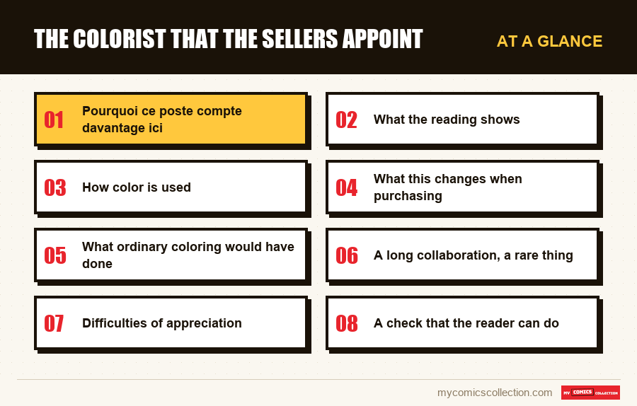
This article explains why this item matters more here than elsewhere, what the reading shows, how color is used, and what this changes when purchasing.
Pourquoi ce poste compte davantage ici
The answer lies entirely in the nature of drawing, and it is mechanical.
A drawing loaded with hatching defines its volumes and values itself. Color complements this: it informs the material and the atmosphere, but the image would hold up without it. The colorist works in the gaps of an already complete drawing.
A drawing made of large flat areas, on the contrary, leaves immense surfaces empty of any information. It is not an incomplete drawing: it is a drawing which delegates part of its rendering. The areas that the hatching would have occupied are waiting for color.
The colorist therefore becomes co-author of the image rather than finisher. It decides the depth, the time of day, the temperature of a scene: information that the drawing did not provide and was not intended to provide.
This is why his name is circulating. Readers perceived his contribution without needing to be pointed out to them, which is the best indicator of its reality.
What the reading shows
The data below comes from fixed price announcements from August 29, 2026 and describes both the wording of the titles and the prices asked.
Un coloriste nommé
26 annonces explicitly credit him alongside the designer, 3,99 à 54,00 $demandés, médiane 14,99 $. Aucune annonce certifiée.
Twenty-six spontaneous mentions for a position usually invisible.
A significant sales practice
These titles combine the two names like a couple, like a writer-cartoonist tandem. This is recognition from the market, not from the publisher.
Aucune prime observable
The median at $14.99 remains within the general range of the universe. The mention of the colorist does not translate into any valuation.
Recognition without a market
The name is circulating and is worthless. This is exactly the configuration observed for the editorial directions and covers.
How color is used
Four choices emerge, all consistent with the drawing they accompany.
Des gammes réduites. Each sequence is limited to a few shades, often a dominant and its complement. This economy echoes that of the line and avoids saturating the flat areas.
Color as place information. A change of scale signals a change of place or time more effectively than a cartouche. It is a narrative function, not a decorative one.
Peu de dégradés. The surfaces remain largely flat, which preserves the readability of the shapes and respects the logic of a solid drawing.
Le noir laissé noir. No attempt to “catch up” with the black masses by slipping in dark shades. They remain voids, which is what they must be.
This last point is the most important and the most counterintuitive. An ordinary colorist would seek to occupy these surfaces: it is his job to fulfill, and that would destroy the system.
Restraint is the main skill here. Knowing not to color an area is more difficult than knowing how to color it, because nothing in the order requires it and the result can appear as unfinished work.
It's a professionally uncomfortable position: the best work is the work you don't see, and it looks like less work.
What this changes when purchasing
Three practical consequences, which arise from the fact that color here carries part of the image.
Editions matter more. A print that shifts the shades or saturates the ranges damages half of the visual information, not just a finish. The gap between a good and a bad edition is greater here than elsewhere.
The black and white versions change the work. Some reissues present these pages without color. It is not a degraded version but a different version, where the information carried by the color disappears without being replaced.
The paper plays straight. An absorbent support dulls already reduced ranges, bringing them closer to gray and erasing the contrasts of place.
These three points converge towards the same recommendation, already valid for drawing and reinforced by color: at a comparable price, take the best-made edition.
What ordinary coloring would have done
The best way to perceive restraint work is to imagine precisely what someone else would have done in the same place.
It would have illuminated the blacks. A colorist who receives a board half occupied by solid colors sees it as a surface to be treated, and the temptation to slip in a very dark blue to suggest a material is almost irresistible. The result would be immediate: the masses would cease to be voids to become objects, and the anxiety they produce would disappear.
She would have multiplied the shades. A scene with several characters spontaneously calls for one color per character, to help distinguish them. Here, the distinction comes through the silhouette, and adding hues would blur the reduced range that identifies the place.
She would have modeled the volumes. Gradients on faces and bodies are common practice and would give a richer rendering: at the exact price of the solid readability that the drawing was seeking.
None of these three decisions would be professional misconduct. These are good practices applied to a drawing that doesn't want it, and this is precisely what makes the exercise difficult: you have to unlearn what you know how to do.
A long collaboration, a rare thing
A final element explains the quality of the result, and it relates to duration rather than talent.
On most series, the colorist changes frequently: depending on availability, budgets, arcs. Each new contributor takes a drawing that he does not know and applies his own reflexes, which produces visible breaks from one volume to another.
A collaboration maintained over many years allows something else: the colorist ends up knowing what the designer expects without him asking, and especially what he does not want. This knowledge is not transmitted by a note of intention; it is acquired by working.
This is what gives the whole its homogeneity of treatment over decades, a property that we spontaneously attribute to the designer alone even though it supposes two people.
For a reader, the practical consequence is pleasant: the volumes follow one another without any difference in rendering, which is far from guaranteed on works of this magnitude.
Collecting this series?
Track what you own, what you are missing and what your collection is worth. 7 day trial.
Start my trial →Difficulties of appreciation
Invisible work by construction
The restraint is not noticeable. It is necessary to compare with ordinary coloring to perceive what has been avoided.
Misleading reproductions
Online images undergo conversions that shift hues. Judging colorization on screen is hazardous.
Several colorists depending on the titles
The branched universe has different players. The name on the cover does not guarantee who colored.
Recolorizations in reissue
Some covers modify the original scales, sometimes without indicating it.
A check that the reader can do
All of the above can be controlled without special expertise, with two volumes and five minutes.
Take a plate from this work and a plate from a contemporary series with a comparable design in terms of density of lines. Count not the colors used but the number of distinct shades present in the same box.
The spread is usually three or four to one. Where an ordinary box has eight to twelve shades, a box here often has three: and it's not a poverty of means, it's a system that lets black and white carry the rest.
This simple counting makes visible what no description can make visible, and it works just as well on a reissue as on an original print.
A structurally underestimated profession
The case illuminates a general situation that goes beyond this work.
The colorist is the least visible position in a chain that has several. He doesn't appear on the cover, or in the ads, or in the comments, and his work is most easily attributed to someone else, usually the cartoonist.
This invisibility is not proportional to the contribution. On a drawing which delegates its rendering, it can reach half of what the reader perceives, and yet no one would know how to name it.
What is exceptional about this case is therefore not the contribution of the colorist, others do the same elsewhere, but the fact that it was noticed. Twenty-six spontaneous announcements are a rare recognition.
The reason for this is probably that the graphics device makes this contribution observable: on large flat areas, we can see what the color does, while a dense drawing hides it in its lines.
What to record
On this question, the sheet must carry information that even detailed catalogs omit.
The colorist of each title, rated at the same rank as the designer. The universe being branched between numerous titles and numerous contributors, this is the only way to know who we are talking about when we find a successful, or unsuccessful, range. No cover mentions it, and the announcements only do so as an exception.
This is also what makes it possible to constitute a homogeneous whole if we follow a team rather than a character.
The mention of a recolorization in reissue, when it is detectable: a reissue whose scales have been retouched is not the same visual object as the original, and noting this avoids comparing two copies in the belief that they should look similar.
These two fields document the half of the image that no one records: on a work where this half is precisely what distinguishes it.
Frequently asked questions
Because on a drawing made of large flat areas, the color is not a finish: it occupies the surfaces that the hatching would have filled. The colorist becomes co-author of the image rather than finisher, and readers perceived this without being told: 26 ads spontaneously credited him.
It uses small scales, few gradients, and serves as location information-a change in hue signals a change in place or time more effectively than a cartouche. Above all, it leaves the black masses intact instead of trying to occupy them.
Not at all: the median of these announcements is $14.99, within the general range of the universe. The name circulates and is worthless: a configuration already observed for the editorial directions and cover signatures.
They are different, not degraded. The information carried by color (depth, time of day, change of location) disappears without being replaced, which gives a more abstract reading. It is another visual object, to be considered as such.
Difficultly. Reproductions undergo conversions which shift the hues, and on reduced ranges this shift changes a lot. On a work where the paper and the print play a direct role, the copy in hand remains the only reliable judge.
Who colored this volume?
No cover says that, and that's half of what you're looking at.