
The black and white of this work is not an imposed constraint but the condition of its graphic device. Two drawing regimes coexist in each panel (simple figures from the cartoon, settings and humans treated in detail) and it is the absence of color which makes this gap perceptible. Add a colored layer and the two regimes become visually closer: what the line separated, the color brings it together, to the exact detriment of the desired effect.
This dependency explains why the original version remains the reference even if the other legitimately exists.
We will see here what the absence of color requires us to do, how the values are distributed, what black and white allows that color prohibits, and what it costs the reader.
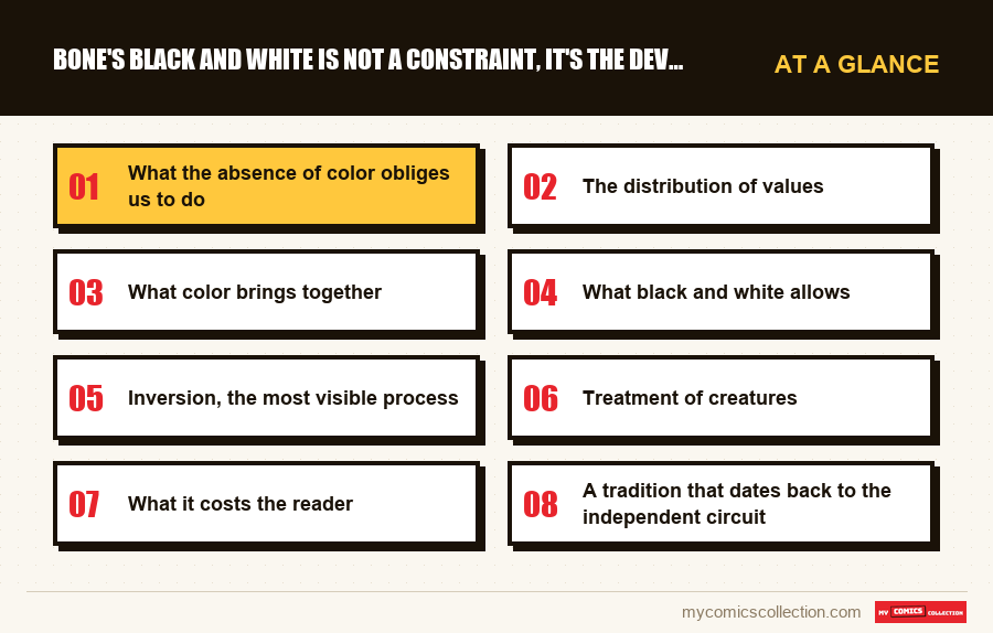
What the absence of color obliges us to do
Four functions that color provides elsewhere must here be obtained by the line, and each leaves a visible trace.
Séparer les plans. Without color to distance a background, it is necessary to play on density: decorations treated in frames and hatching, figures left in light surfaces. The foreground is therefore systematically the emptiest.
Identifier les personnages. Nothing distinguishes two figures by their color. Differentiation occurs through silhouette, build and accessories, which imposes clearly distinct shapes.
Indiquer l'heure et l'atmosphère. A night scene cannot be blue. It is obtained by inversion (predominantly black surfaces, characters in reserve) a process which is obvious once spotted.
Hiérarchiser l'attention. The eye goes towards the strongest contrast. The designer therefore decides what we look at by placing his blacks, without any other tool.
These four obligations explain the general appearance of the boards. Nothing is decorative: each dark area fulfills a function, which is not the case in a drawing intended to be colored.
The distribution of values
The main figures, almost white
Clean outline and interior left empty. They stand out immediately against any background, whatever the context.
This is what allows you to follow them in a busy scene.
Human characters, in average values
Hatching, cast shadows, worked clothing. They occupy an intermediate register which distinguishes them from the two extremes.
The decorations, from gray to black
Forests, interiors and nights provide the dark masses against which everything else stands out.
Trois niveaux, jamais mélangés
This hierarchy is maintained with remarkable consistency over thousands of pages, and it is this which makes the whole readable.
What color brings together
This is the central point and explains why the two versions are not equivalent.
The device is based on a processing gap between two drawing regimes. This gap is not thematic but graphique: we see that the main figures are not made of the same material as what surrounds them.
A colorization applies a unique logic to the entire box. The same rules of hue, saturation and shadow apply to the figures and settings, which places them in the same visual world.
The gain is real for narrative readability: a child follows more easily, and the loss is just as much: the strangeness of the protagonists in their environment diminishes.
This is not a colorization defect but a consequence of what color does by nature. No colorimetric treatment would fully preserve a difference based on the absence of color.
A check that the reader can do themselves. Take the same board in both versions and count the number of seconds it takes you to spot the protagonists in a crowd scene.
In black and white, they are obvious: they are the only clear shapes. In color, you have to look a little: they have become characters among others. This is exactly the effect described, measurable without any expertise.
What black and white allows
Three things that color would make difficult, if not impossible.
Sudden tonal transitions. Going from a comic scene to a threatening scene in one page is done by a shift in values : the page becomes black. In color, it would take a transition, and therefore time.
The completely black night pages. They work perfectly in reserve and cost almost nothing to produce. A colorized version must put something there.
Sustainable production alone. Over thirteen years and thousands of pages, doing without the colorization step completely changes the economics of the project: it's also what made self-publishing possible.
This last point is not aesthetic and it is decisive. The budgetary constraint and the artistic choice point here in the same direction, which is rare and explains the consistency of the result.
Inversion, the most visible process
A mechanism constantly comes up and it deserves to be isolated, because it is the one that is most easily identified once named.
In an ordinary scene, the figures are light against a darker background. In a night or danger scene, the relationship is reversed: the page becomes predominantly black and the characters appear in reserve, cut out from the mass.
This inversion produces an immediate effect without any narrative element changing. The same characters, in the same posture, become vulnerable because the figure-ground relationship has turned around them.
It is a tool that color also possesses, but which it applies by nuances: a darker blue, a rarer light. Black and white only knows two states, which makes the switch brutal and therefore more efficient.
Once this process is identified, we see it everywhere, and it becomes a reliable indicator: the report of values on a page announces its register before a single bubble has been read.
Treatment of creatures
A third group partially escapes the hierarchy described above, and this gap is instructive.
The creatures that inhabit the valley belong neither to the register of main figures, too detailed, nor to that of humans: too stylized. They occupy a deliberately unstable intermediate position.
This graphic indeterminacy corresponds exactly to their narrative status: they are at first comical, then disturbing, without anything changing about them. A drawing which would have fixed them in a register would have made this re-evaluation impossible.
They are also the only figures whose treatment varies according to the scenes: more rounded in the comic sequences, more angular and darker elsewhere, with progressive transitions that the reader does not notice.
This is probably where the graphic craftsmanship is at its finest, and it is invisible by construction-a reader who notices the change would perceive the string rather than the effect.
Collecting this series?
Track what you own, what you are missing and what your collection is worth. 7 day trial.
Start my trial →What it costs the reader
An entry effort
A young reader accustomed to color finds the first pages austere, before the readability compensates.
Close human characters
Treated in the same register of values, they are less easily distinguished from each other than the main figures.
Challenging dark scenes
Mostly black pages require good printing and correct light to remain readable.
Long-term fatigue
Thousands of highly contrasted pages challenge the eye more than a set in soft colors.
A tradition that dates back to the independent circuit
It is worth putting this choice in its publication context, because it was not isolated.
The circuit of self-publishing and small structure printed in black and white out of economic necessity, and this shared constraint produced a generation of designers who learned to use it. Several major works from this period fall into this category, in very different registers.
What distinguishes the successes of this period is having treated the absence of color as a language rather than as a lack. The series which underwent it produced gray and dull pages; those who exploited it produced contrasts that color would not have allowed.
This work clearly belongs to the second category, and its case is particular in that the black and white does not only serve the atmosphere but the very structure of the drawing.
This is also why the comparison with other black and white series from the same period is instructive: we see completely different uses of the same constraint, which is the sign that it had become a tool and not a limit.
A reader curious about this period will benefit from reading several of these works in succession. The gap between them is much greater than between two color series, precisely because each had to invent its own solution.
How to choose your version
The answer depends on who's reading, and it's more clear-cut than is usually said.
For an adult reader attentive to drawing, black and white. This is the only version where the two-regime system is visible, and it constitutes the main graphic interest of the work.
For a child, color. The gain in narrative readability far outweighs it, and the difference in regimes is not what he is looking for.
To offer, color. It passes better, handles better, and survives loans better.
To reread, black and white. A second reading focuses on the construction more than the story, and this is where the original version takes all its advantage.
What to record
On a work existing in two visual regimes, the sheet must make it possible to find the right copy for the right use.
The boards whose value treatment left an impression on you, with their volume. The night pages, the tonal shifts and the crowd scenes are where the device is best seen, and these are precisely the places you want to show someone to explain what this drawing does. Without a note, they cannot be found in several thousand pages.
This is also what allows us to compare the two versions on the same boards, the only way to judge on parts rather than on principle.
The print quality of your black and white copies, noted separately from their condition: a highly contrasted page suffers more than another from a poor print, the blacks becoming caked and the reserves becoming dirty, and two copies in perfect condition may not show the same thing.
These two mentions serve a work whose graphic interest plays out in manufacturing details that nothing else records.
Frequently asked questions
Both, and they point in the same direction. Self-publishing required reducing costs, but the graphic device, two drawing regimes which must remain perceptibly distinct, depends on the absence of color. The budgetary constraint and the artistic choice reinforce each other instead of contradicting each other.
The treatment gap between the main figures and their environment. Colorization applies a unique logic to the entire panel, which places the two regimes in the same visual world, and the strangeness of the protagonists is attenuated. This is not a colorization defect but what color does by nature.
Take the same board in both versions and time how long it takes you to spot the protagonists in a crowd scene. In black and white they stand out, the only clear shapes in the box; in color you have to look. The effect is measurable without any expertise.
Black and white for an adult reader attentive to drawing and for any proofreading; color for a child and as a gift, where the gain in narrative readability largely outweighs it. These are not two qualities but two uses.
It requires an input effort for a reader accustomed to color, then the readability compensates: the main figures are the only clear surfaces and follow each other effortlessly. Very dark scenes, however, require good printing and correct lighting to remain comfortable.
Which board should I show to explain this drawing?
Night pages, shifts, crowd scenes: nowhere to be found in thousands of pages without notes.