
Usagi Yojimbo is a black and white series, except for a period when it was published in color with a dedicated colorist. This parenthesis is real and verifiable: announcements from this period systematically credit two names instead of one. It divides readers, and above all it creates an inventory difficulty:the same story exists in both states, without anything on the cover of a reissue indicating which one you're holding.
The question of color is the only point on which readers of this series are really divided.
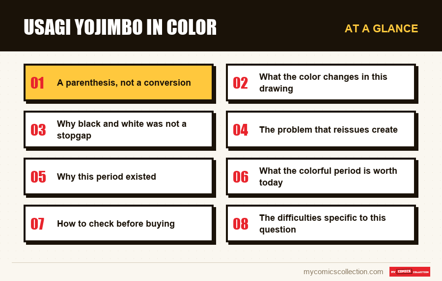
This article locates this period, explains what color adds and removes from this specific drawing, details why reissues blur the distinction, and indicates what an inventory should record.
A parenthesis, not a conversion
We must first correctly dimension the phenomenon, which is often presented sideways.
The series did not “switch to color” and then “return to black and white” in the manner of an editorial evolution. A period has been colored, framed by periods which were not, in a publication history which includes four successive houses.
This period is easily identified in the advertisements: they credit two names where all the others only have one. The presence of a colorist in the credits is the most reliable marker of the era concerned, more certain than the number, which does not designate anything on this series.
The proportion remains in the minority over forty years. It's a parenthesis, but a parenthesis which has produced dozens of issues and which therefore really weighs in a collection.
What the color changes in this drawing
It makes the silhouettes more readable
In a crowd scene or a quick confrontation, color instantly separates the protagonists. In black and white, this separation is entirely based on the drawing.
This is the clearest benefit, and it is real on dense pages.
It lightens the hatching
A design designed to carry valuable information alone becomes loaded when color assumes the same function. Colorizing a line designed for black and white produces visible overload.
It breaks the unity with the lettering
The text is drawn in ink, in the same material as the decoration. A colored layer added on top introduces a separation between the two that did not exist.
It changes the pace of reading
A colored page is read more slowly: the eye stops on the bright areas. On stories constructed for a rapid sequence, this slowdown is noticeable.
Why black and white was not a stopgap
The common argument is to say that these series were in black and white due to lack of resources, and that they would have switched to color if they could. This is partly true and generally misleading.
Cost was indeed the initial reason for the choice, in an independent circuit where color printing was out of reach. But an author who draws for years for black and white develops a trait that depends on it.
Concretely, the information that the color would carry elsewhere is distributed here over the density of the hatching, the thickness of the contours and the size of the black areas. These elements do not disappear when you add color: they remain, and they do double duty.
This is the technical reason why coloring a drawing of this type rarely gives a result as clean as a drawing designed for color. The problem is not the quality of the colorist's work, it is structural.
Conversely, a reader who discovers the series through the colorful period and finds it charged must know that this impression is due to the device, not the drawing.
Neither version is the “right” one. The colored period was published as such, with the author's agreement, and is fully part of the work.
What would be a mistake is to discover the series through this period and draw an overall judgment from it. This is the only portion that doesn't look like the rest, and it represents a minority of the forty-year-olds.
The problem that reissues create
This is where the question ceases to be aesthetic and becomes practical.
The stories published in color were subsequently reproduced in collections, and these reproductions do not all retain the color. Some reissues present initially colored pages in black and white, for reasons of uniformity of collection or cost.
The same story therefore exists in two states, and the cover of a collection does not indicate which one it contains. Two neighboring volumes in a library can offer the same story in two different forms.
For a reader, this produces memory confusion: we remember a scene in color, we cannot find it, and we doubt whether we have read correctly.
For a collector, this produces a duplicate of a particular kind: two copies of the same content that are not interchangeable, since they do not show the same thing. This is the only case in this work where a duplicate really adds something.
Why this period existed
The decision is better understood in its commercial context, and it is not an aesthetic whim.
At the time this parenthesis opens, independent black and white was emerging from a phase of craze followed by a clear decline. The shelves were filled with black and white series launched in the hope of replicating a few successes, then the public turned away from them en masse.
In this climate, a black-and-white series carried a perceptual handicap independent of its quality: it looked like what buyers were wary of. Switching to color was less an artistic choice than a way to distinguish oneself from a discredited ensemble.
This is also what explains the subsequent return to black and white. Once the context was dissipated, the reason for the color disappeared with it, and the original format (less expensive, better suited to the line) once again became the obvious choice.
This reading has the advantage of removing any polemical charge from the episode. It was neither a betrayal nor a thwarted ambition, but an adaptation to a market that lasted as long as that market lasted.
What the colorful period is worth today
A remark is necessary, because logic would dictate that this parenthesis be valued as a singularity.
She is not. The price readings carried out over the different periods of this series show remarkably flat raw medians, and the colored period does not stand out from this: it is even among the lowest.
In other words, the market does not pay for the rarity of the device. What is however unique in the work (the only colored portion, the only one where the author has delegated part of the production) does not produce any observable bonus.
Two explanations combine. On the one hand, the circulation of this period was comfortable, the color having precisely served to broaden the audience. On the other hand, singularity only interests the market when it is sought by buyers, and here they are looking for black and white.
For a collector, the consequence is favorable: it is one of the most accessible portions of the work, and the one which offers the most visual material for a given budget.
Collecting this series?
Track what you own, what you are missing and what your collection is worth. 7 day trial.
Start my trial →How to check before buying
Three checks are enough, in order from the most reliable to the most convenient.
Look for a second name in the credits. This is the only criterion that does not deceive. It appears in the title of the issue and, often, in the title of announcements from this period.
Trust the publisher and the year, never the number. The general rule of this series applies here with an additional consequence: the number does not even allow us to know whether the copy is in color.
Request a photograph of an interior page for an online purchase. The cover doesn't provide any information, as everything is colored, including the periods in black and white: this is the most common pitfall on this specific point.
The difficulties specific to this question
Nothing says it on the cover
Neither the issues nor the collections mention on the front whether they are in color. You have to open, or read the credits.
Single photo ads
A colored cover says nothing about the interior: all the covers in the series are in color, even on the black and white periods.
Collections that discolor
Some covers present stories published in color in black and white, without indicating this anywhere.
A little-known marker
The credit of a second name in the credits is the most reliable benchmark, and almost no one looks for it.
What this parenthesis says about the rest
As is often the case with this work, the exception illuminates the rule.
This period is the only one where the author delegated part of the production of his pages. Everywhere else he writes, draws and letters himself: all comes out with one hand.
That the only observable delegation is also the only point of discussion between readers is probably not a coincidence. What makes this series consistent over forty years is the absence of external intervention., and the colored parenthesis is where this absence interrupts.
This does not condemn color, the result of which has its supporters. This explains why these issues appear different to readers unable to say why: it's not the story that changes, it's the number of people who touched the page.
What to record
The field to be maintained here is unique in this collection, and its absence produces an error that no other field makes up for.
The colorimetric condition of the copy, separately from the story it contains. Since the same story exists in color in a publication and in black and white in a reissue, the sheet must distinguish the contents from the container: otherwise your inventory will indicate a duplicate where you have two objects which do not show the same thing.
This is the only place in this work where the question “do I already have it?” » calls for a nuanced answer rather than a yes or no.
The presence of a colorist credit, when it appears. It is the marker which allows a number to be linked to the correct period without depending on a numbering which means nothing on this series.
These two fields cost a few seconds per record and avoid the only confusion that reading does not clear up by itself.
Frequently asked questions
No. A period was published in color with an assigned colorist, framed by periods which were not. It is a minority parenthesis on the scale of forty years, but which produced dozens of issues and therefore really weighs in a collection.
By the credits: these numbers credit two names where all the others only have one. It is the most reliable marker, and safer than the number which designates nothing in this series. Please note, the cover does not provide information: all covers are in color, including black and white periods.
She duplicates him, which is not the same thing. A line developed for black and white carries valuable information in its hatching, contours and solid areas; the color assumes the same function and the result appears busy. The problem is structural, not attributable to the colorization work.
Not systematically. Some covers present in black and white stories published in color, for reasons of homogeneity of collection or cost, and nothing on the cover indicates this. The same story therefore exists in two states.
There is no justification for it: it was published with the author's consent and is fully part of the work. What would be a mistake is to discover the series through it and draw an overall judgment from it, since it is the only portion that does not resemble the rest.
The same story, two states
This is the only case in this work where “do I already have it?” » calls for a nuanced response.