Stan Sakai letters his pages by hand, and he practiced lettering as a profession before becoming known as an author. This detail passes for an anecdote; this is actually what explains the density of his plates, the way his dialogues occupy space, and why his short stories fit into so few pages. Lettering is not a finish placed on a finished drawing: with him, it is a compositional constraint present from the first line.
This is the least commented on aspect of this work, and probably the one which best explains what readers perceive without knowing how to name it.
This article explains what hand lettering actually changes, why this skill makes its pages denser, what it means for reissues and translations, and how to take it into account in an inventory.
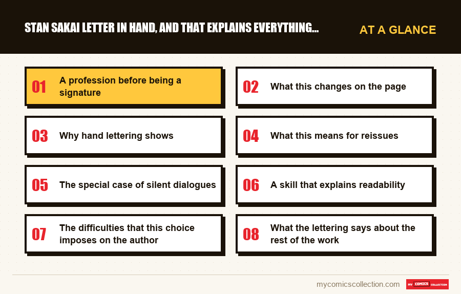
A profession before being a signature
Lettering is the least visible part of making a comic book, and one of the most technical.
It consists of placing the text on the page: sizing the bubbles, distributing the lines, choosing where the tail of the bubble points, deciding what fits in a title block and what should appear in dialogue. Done correctly, no one notices. Done badly, the reader stumbles without understanding why.
Stan Sakai has worked in this profession for other authors, notably on a long-running humor series that he wrote for decades. He therefore learned to fit another's text into another's pages., which is the most demanding exercise of the position.
When he composes his own pages, he has this skill upstream rather than downstream. He doesn't draw and then look for where to fit the words: he knows, by drawing, how much space the words will take up.
What this changes on the page
More boxes
A page often has six to eight boxes where a current production has four or five. This density is only possible if the text is calibrated before cutting.
This is the mechanical reason why a complete story fits into one issue.
Bubbles that follow the drawing
The bubbles are lodged in the voids of the decoration rather than covering the image. They follow the contour of the elements, which lettering added after the fact does not allow.
A directed reading pace
The order of the bubbles guides the eye along a chosen path. On a dense page, this is what prevents the confusion that would be produced by the same number of poorly ordered boxes.
Built-in sound effects
The onomatopoeias are drawn with the decor, in the same gesture and the same ink, rather than added afterwards. They become part of the image instead of floating on it.
Why hand lettering shows
An uninformed reader rarely distinguishes manual lettering from computer lettering, but he always perceives the effect.
Irregularities. No letter is exactly the same as the previous one. This tiny variation gives the page a vibration that the perfect repetition of a font doesn't have.
Adaptation to content. The size and thickness of the line vary according to the intensity of the aftershock, continuously rather than in stages. A cry is not “in bold”: it is written larger, more pronounced, with a progression.
The unit of matter. The text and the drawing come out of the same tool, with the same ink on the same paper. They are not distinguished as two layers superimposed.
This last property is decisive in a black and white series. When there is no color to separate the planes, the homogeneity of the material becomes the main factor of visual coherence. An added lettering would produce an immediately noticeable break.
A simple test to convince yourself. Take a page and look at what's happening around the bubbles rather than inside them.
You will notice that the decoration stops exactly where the bubble begins, without being covered: the drawing was composed knowing where the text would go. This is the opposite of common practice, where the bubble hides part of what has been drawn.
What this means for reissues
Manual lettering integrated into the drawing poses concrete problems as soon as we want to republish or translate, and these problems are visible on the objects.
It cannot be replaced properly. Computer lettering can be removed and redone by changing a layer. Ink lettering is part of the plate: removing it involves erasing a portion of the drawing and reconstituting it.
Translations must therefore arbitrate. Either they cover the original lettering, which hides some of the design and breaks the unity of the material; or they reconstitute, which is expensive. The two solutions meet depending on the editions.
Onomatopoeia often remains as it is. Being designed with the decor, they are the most difficult to replace. Many translated editions keep them as they are, which produces an assumed mixture of languages.
These are seemingly minor details. However, they determine the difference in perceived quality between two editions of the same story, a difference that buyers note without always attributing it to its cause.
The special case of silent dialogues
A usage deserves to be isolated, because it is only possible for an author who masters both positions.
Some sequences do without text entirely. These are often the most important: a confrontation, a separation, a moment of contemplation. They can last an entire page without a single bubble.
This kind of sequence is difficult to obtain in an ordinary production, where the absence of text is perceived as a lost page and where the screenwriter, not writing himself, has no physical sense of what silence costs or yields.
Here, the decision to remove the text is made by the person who would have placed it. She knows exactly what space is available and what the design can do with it., and she composes the sequence accordingly rather than leaving a gap.
The effect is clear when reading: these silent pages slow down the pace without breaking it, because the number of boxes increases to compensate for the absence of text to read. The perceived duration remains constant.
A skill that explains readability
It remains to name the most concrete benefit for the reader, the one which manifests itself without being sought.
These dense pages are quick to read. It's counterintuitive: six to eight boxes per page should slow you down, and they don't.
The reason is that the path of the eye is entirely determined. There is never any hesitation about which bubble to read next, never going back to check who is speaking, never a box that we doubt comes before or after its neighbor.
This lack of hesitation is the direct product of the letterer's profession. A professional letterer spends his career solving exactly this problem on the pages of authors who did not anticipate it.
The reader who finds these stories “fluid” without knowing why describes this. It is neither the simplicity of the drawing nor the clarity of the scenario: it is an invisible work of placement, carried out by someone who practiced it for a living before practicing it for himself.
Collecting this series?
Track what you own, what you are missing and what your collection is worth. 7 day trial.
Start my trial →The difficulties that this choice imposes on the author
An incompressible production time
Lettering by hand takes hours per page. This is one of the reasons why this series has always been released at a measured pace.
No easy fix
A poorly worded reply cannot be changed after the fact. The text must be stopped before inking, which prohibits late rewriting.
A costly export
Each edition in a foreign language requires editing work that computer lettering would have made almost free.
Total dependence on the author
No one else can letter these pages without the difference being visible. The position is not delegable.
What the lettering says about the rest of the work
This practice is consistent with everything observed elsewhere in this work, and this consistency is instructive.
An author who documents his settings, who refuses to delegate his lettering, who keeps a complete story by number and who retains his rights through four successive publishers applies the same logic in four different areas: keep control over everything, even if it means producing more slowly.
It's not an obvious choice. It involves giving up volume, and therefore part of the income, and accepting that a career is built slowly.
The result is a work of rare homogeneity over forty years. There is no weak period attributable to a poorly chosen collaborator, no break in style due to a replacement, no visibly botched act to keep a date.
This homogeneity is also what makes the series difficult to divide into commercially distinct periods, and, as we have seen elsewhere, what the raw market confirms by not distinguishing the eras.
Ce qu'il faut enregistrer
On this specific aspect, the useful field concerns neither the condition nor the rarity, but the manufacture of the edition that one owns.
The treatment of the lettering in your copy. Original lettering preserved, covered by a translation, or reconstituted? This is the variable that most clearly distinguishes two editions of the same story, and nothing on the cover indicates this.
A collector who owns several editions of the same volume will find that this is the only difference that really matters when reading: more than the paper or the format, which are noticed once and then forgotten.
The language of onomatopoeia, when it differs from that of the text. This precision seems excessive until the day we compare two editions and we no longer know which was more careful.
These fields are of no use in evaluating an item. They are used to choose which of your copies to reread, which is the most frequent use of an inventory once the collection has been established.
Questions fréquentes
Rarely consciously, always in its effects. No letter is identical to the previous one, the size varies continuously with the intensity of the replica, and the text comes from the same tool as the drawing. In a black and white series, this unity of material is the main factor of visual coherence.
Because the text is calibrated before cutting. An author who knows exactly how much space his dialogues will occupy can squeeze six to eight boxes where a current production fits four or five. This is the mechanical reason why a complete story fits into a single issue.
It depends on the edition, and there are two solutions: covering the original lettering, which hides some of the drawing, or reconstituting it, which is expensive. The onomatopoeias, drawn with the decor, often remain as they are: hence the mixture of languages that we observe in certain editions.
Clearly. Lettering by hand takes hours per page and the position is not delegable, as no one else can do it without the difference being visible. This is one of the reasons for the measured pace of this series over forty years.
Not for choosing what to read: the content does not vary. On the other hand, if you are hesitating between two editions of the same story, the treatment of the lettering is the difference that will be most noticeable in use, more than the paper or the format.
Two editions of the same story, which one to reread?
The treatment of the lettering is the difference that matters, and neither cover indicates this.