From the middle of Cerebus, a second artist takes charge of all of the decorations, and the work changes its visual nature. Gerhard joined the publication around the sixty-fifth issue and drew all the backgrounds until the three hundredth, almost twenty years. This is not an assistant position: it is a division of labor with two hands on the same square, one drawing the characters, the other the world around them. There is virtually no equivalent of this duration in the medium.
We talk a lot about the author of this work (his writing, his positions, his controversies) and very little about the man who drew half of it for two entire decades. The imbalance is striking once you pay attention to it, and it is well worth correcting.
This article explains what this collaboration really produced, why it remains so rare in this profession, and why it constitutes a very practical argument for a reader who hesitates before the scale of the whole.
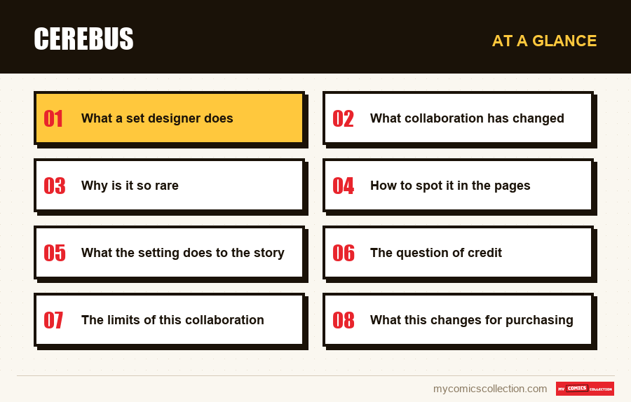
What a set designer does
The function exists elsewhere, but rarely in this form, and it must be specified in order to measure what is at stake here.
In current production, a single artist creates the entire panel, characters and backgrounds, then an inker goes over the whole thing. When an assistant intervenes, it is generally for secondary tasks, without credit, and on an ad hoc basis.
What we are talking about here is something else: two artists work on the same board, each on a defined part, from the first line to publication. One draws the characters and the action, the other constructs the space in which they find themselves.
This division requires permanent coordination. A perspective decided by one constrains the posture of the other; a very detailed setting can crush a figure, a setting that is too empty can leave it floating. This is not a distribution of convenience but a real visual writing for two.
What collaboration has changed
Spaces that exist
Before, the backgrounds were functional: a wall, a door, whatever was needed to situate the scene. Afterwards, the places have architecture, depth and history.
The story gains a dimension that no writing could give it alone.
A rare density of texture
The materials (stone, wood, fabric, metal) are treated with a precision which requires considerable working time per board, maintained over hundreds of issues.
A deliberate graphic contrast
The main character remains drawn in an almost caricatured register, posed in settings of meticulous realism. This shift produces an effect that neither would achieve alone.
A twenty-year continuity
The same hand on all the sets for two decades gives the universe a spatial coherence that team changes usually make impossible.
Why is it so rare
This configuration exists practically nowhere else over this period, and the reasons are economic before being artistic.
The cost. Two artists on the same page means two payments for a single page. In a tight monthly publication economy, the margin generally does not exist, except, precisely, for an author who publishes himself and decides alone on the distribution.
Coordination. Working in pairs on the same hut requires working proximity that today's dispersed production makes difficult. The two artists must understand each other on details that nothing writes down.
The duration. This is the rarest point. A collaboration of this type can take place over an arc or two; maintaining it for twenty years presupposes a professional understanding that withstands time, disagreements and difficult periods.
It therefore requires the combination of complete editorial independence, geographic proximity, and an exceptionally stable working relationship. It is this conjunction that is rare, not the idea.
A practical argument for the reader. The work is visually much more beautiful after the arrival of this second artist than before. A reader put off by the early design therefore has a legitimate reason to jump forward.
This is advice that is rarely given, we usually recommend reading in order, but it is defensible here: the parodic period at the beginning is not necessary to understand what follows, and it does not have much to do on the graphic level.
How to spot it in the pages
For a reader new to the work, knowing what they are looking at changes the experience. Three signs are immediately apparent.
Unequal density in the same box. A character drawn in a few clear lines in front of a wall worked to the millimeter: this contrast is the signature of the collaboration, and it is visible on almost every page of the second half.
Perspectives held. The interiors are built in depth, with coherent vanishing lines from one box to another. It's an architectural job that very few comics undertake, because it doesn't yield anything in terms of immediate readability.
The worked surfaces. A stone wall is not suggested by a few hatchings but drawn stone by stone. This seems anecdotal, until we measure what hundreds of boards represent at this regime.
What the setting does to the story
A very elaborate setting is not only more beautiful: it modifies what the story can tell, and this is the most interesting point of this collaboration.
A political scene in a summary setting plays out between characters. The same scene in a built palace, with its proportions, its furniture and its wear, is played out between characters and an institution. The place ceases to be a background to become a mute actor: it is a permanent reminder that it existed before them and will survive them.
On a work whose central subject is power and its institutions, it is not an ornament. The buildings say what the dialogues do not need to explain: the antiquity of an order, the weight of an administration, the gap between the dignity of a place and the mediocrity of what is going on there.
This is also what allows the story to hold very long sequences in a single space, dozens of pages in the same room, without the reader becoming visually bored. A comic strip with basic settings cannot afford this: it must change location to renew the image.
In other words, the quality of the decorations authorized a type of narration: static, dialogic, tight: that the work could not have practiced otherwise. The collaboration not only beautified the book, it expanded what it could do.
Collecting this series?
Track what you own, what you are missing and what your collection is worth. 7 day trial.
Start my trial →The question of credit
One point deserves to be asked frankly, because it concerns the way we talk about this work.
Discussions around this publication almost always focus on its author: his writing, his positions, his controversies. The second artist rarely appears other than through a quick mention, even though he drew a considerable part of what we are looking at.
This imbalance is not unique to this case. The medium traditionally attributes works to their scriptwriter, or their main designer, and eliminates those whose work is seen without being signed: inkers, colorists, letterers, decorators.
Over a twenty-year collaboration that transformed the appearance of an entire work, this invisibility is difficult to justify. A reader who likes the pages of the second half likes, for the most part, the work of someone whose name he does not know.
The limits of this collaboration
A sometimes annoying imbalance
The setting occasionally overrides the stage: we look at the wall rather than the character speaking in front. This is the risk of such a worked background.
Slowed reading
These pages demand attention. On an already long and discursive story, this further lengthens the reading time.
A disconcerting contrast
A caricature character in a realistic setting requires adjustment. Some readers never quite get there.
Demanding reproduction
The fineness of the line does not support mediocre prints. On an economical reprint, part of the work simply disappears.
What this changes for purchasing
The last remark has a direct consequence, and it is perhaps the most useful information in this article for a buyer.
The decorations of this work are based on very fine hatching and densely worked surfaces. Print quality is therefore decisive., much more than on a comic strip with simple flat areas.
On a careful print, the textures are readable and the depth works. On an economical reprint, the blacks become thicker, the hatching closes, and entire walls become gray masses. The same story, in the same volume, does not provide the same experience.
In practical terms, this means that it is worth asking for a photograph of an inside double page before purchasing a used collection: not just the cover. It's a precaution that we never take and which, on this specific work, separates two very different objects.
What to note in your catalog
On this work, an unusual field becomes relevant, and two others take on particular importance.
The period, before or after the arrival of the second artist. It is information of content as well as form: it separates two visually very different halves, and it explains why two volumes of the same series can produce incomparable impressions.
The edition of the collection. Over a self-published work over twenty-six years, the collected volumes have seen numerous reprints, varying in quality. Here more than anywhere else it is a piece of data that changes what we really have.
The condition of the back. These collections are thick and heavy; the binding is their weak point and the first place where wear is seen. On old examples, this is the criterion to examine before the corners.
An inventory that includes these three fields allows us to answer the question that really matters in front of a shelf: not “do I have this volume?” » but “does the copy I have do justice to what it contains?” ".
Frequently asked questions
Around the middle of the first hundred issues, and the change is immediately visible. The backgrounds move from a locating function (a wall, a door) to spaces constructed with held perspectives and detailed materials.
No, and the distinction matters. An assistant performs secondary tasks on an ad hoc basis and without credit; This is a division of labor declared on the same board, one drawing the characters and the other the entire space, from the first line to publication.
This is defensible, contrary to common practice. The early parodic period is not necessary for understanding what follows and has little to do graphically. A reader put off by the initial drawing therefore has a legitimate reason to jump forward.
Because it assumes three simultaneous conditions: complete editorial independence to finance two artists on the same page, working proximity allowing constant coordination, and an agreement that will last twenty years. It is the conjunction that is rare, not the idea itself.
More so than almost any other comic. These decorations are based on fine hatching and densely worked surfaces: a mediocre print dulls the blacks and transforms entire walls into gray masses. Requesting a photograph of an interior double page before purchasing a second-hand collection is a justified precaution.
Two copies of the same volume, two different objects
On a work where the line is fine, the printing quality changes what you really have.